Brand

Slogan

Move. Strive. Win.

The slogan of the Directorate embraces all areas of the organisation’s activity, reveals and determines its key goals.

These succinct words have been always associated with sports, and at the same time they define any project. Indeed, any project implies a movement, and its successful implementation is a victory.

The Directorate is a team that strives to put all projects into practice at the highest possible level.

Move. Strive. Win.

Logo

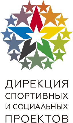
The logo of the Directorate depicts a constellation – a combination of large and small stars that symbolise victories and achievements, varying in their scale and significance. It is such victories that our organisation aims to score.

Sport has meant overcoming, self-conquest and an aspiration to defeat rivals at all times. The logo colour scheme features five primary colours as symbols of the planet’s inhabited continents – blue for Europe, black for Africa, yellow for Asia, red for Americas and green for Australia and Oceania.

The logo centrepiece is a white star that stands for world peace and demonstrates the global scale and role of the organisation’s activities. The five united points refer to unity, equality and friendship of the peoples of the world in sports.
Identity-building elements

The interweaving graphic identity-building elements denote friendship, unity and collaboration in a journey to a common goal.

The dominant gold colour scheme echoes the glow of the gold medal, symbolizing the champion’s title, the joy of victory and the triumph of accomplishment.